
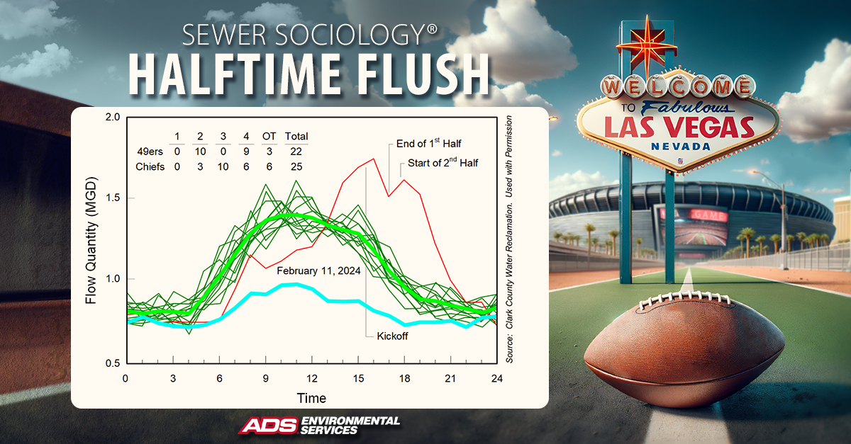
Did you catch the Big Game? I sure did! While tens of thousands of exhilarated fans descended upon Super Bowl LVIII in Las Vegas and millions more gathered to watch the game on television, I settled in as a Sewer Sociologist to watch the game through the eyes of a sewer. Let’s take a look.
Sewer use from the venue and the surrounding area is shown in the graph below. Typical weekdays are shown in green. Typical weekends are shown in blue, and game day is shown in red. The difference between the red curve and the blue curve is the added flow attributed to the Super Bowl.
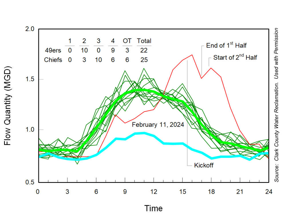
Sewer flows increase dramatically as fans arrive at the stadium. However, note how flows decrease after kickoff as they settle in and focus on the game. Flows increase a bit during halftime – resulting in a modest halftime flush – and decrease again as play resumes in the second half. This game was close and well contested by both teams. The Chiefs (and Taylor Swift) are happy with a Super Bowl win, and I am happy with another Sewer Sociology win!
A big thank you to Jesse Gonzalez at ADS – my MVP – for letting me know we had such great “seats” for the game, and special thanks to the Clark County Water Reclamation District for permission to share this data.
Want to learn more? See more big events and holidays through the eyes of a sewer on our Sewer Sociology page.